Monday, March 07, 2022
Obscurity of the Day: Cartoonist Corner
Nick Nichols was the creator of several obscure newspaper series, of which Adventures of Peter Pen was the best and longest running; but today we're going to cover his most obscure obscurity, a how-to-draw feature called Cartoonist Corner. (We normally shun activity features, but a special dispensation is granted to those teaching the art of cartooning.)
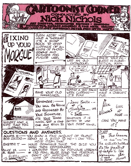
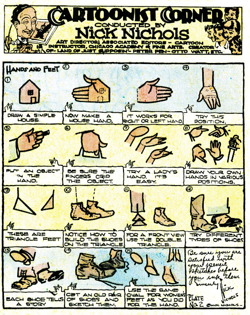
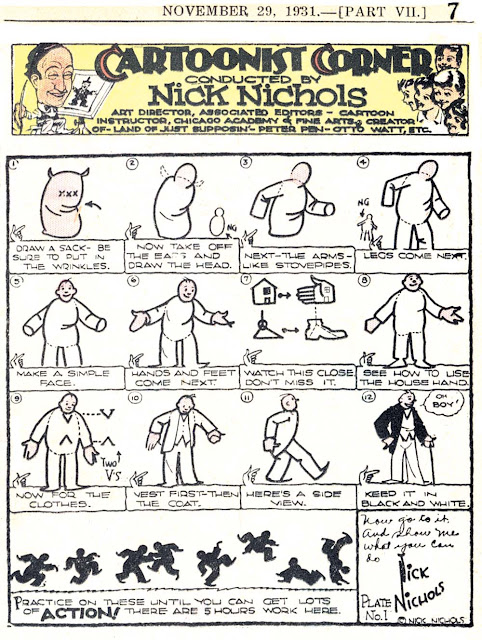
Cartoonist Corner, unfortunately, is one of the least successful cartooning instruction features I've ever seen. Nichols was obviously in love with the well-worn chalk talk gimmick of drawing one object and then transforming it into another, and mistook this for a valid form of drawing instruction. I've seen that sort of thing done elsewhere, but rarely on such an impressively baroque level. Hey kids, if you can draw a flour bag, then just add a head, arms and legs around it, you can draw a man! And if you like that exercise, draw a house, erase most of it, and then draw fingers and a thumb on it, and you mysteriously and amazingly have a hand! Okay, to be fair, in the very short life of Cartoonist Corner Nichols did offer one lesson with actual useful information (top sample) -- create a swipe file/morgue, and come up with a LEGIBLE signature. Words to live by!
Cartoonist Corner was offered by Associated Editors, of which Nichols was (as he notes in the masthead) the art director. The feature was offered as one of their weekly kids' page offerings, and ran from November 29 1931 to May 1 1932. The samples above, from the Los Angeles Times, had spot colour added by the newspaper -- I don't think Associated Editors had colour in mind for the feature.
Labels: Obscurities
The one about hands and feet, well, at least he suggests using real life references in the end. The double triangle for front view of the feet is, as the previous commenter said, the same as using circles for sketches, but that 'house hand' definitely feels like a crutch.
Third one is the worst on this front, this just sounds like straight up bad advice lol


