Saturday, October 29, 2005
Obscurity of the Day : Goofus Animals
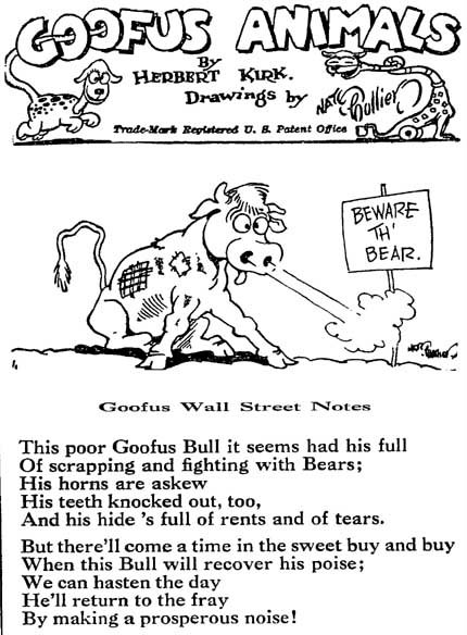
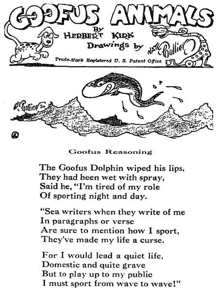
Goofus Animals was a panel cartoon with verse series, a popular form before poetry in newspapers was deemed old-fashioned. Here the poet, one Herbert Kirk, supplies odes to imaginary creatures, while the great Nate Collier adds the visuals. The feature ran 1930-31.
Nate Collier is one of the great forgotten cartoonists. His obscurity, I suppose, is deserved since he never managed to produce anything of truly memorable value in his many years of producing magazine cartoons and newspaper art. He always seemed to be working for the grade-B magazines and newspaper syndicates, though his wonderful artwork should have led him to greener pastures. Ah, well, that's life.
Too bad on these samples his signature is printed so small. Collier's signature is a wonder to behold.
Labels: Obscurities
Comments:
I ran across the Goofus Animals panels when I was working at the library in Troy, NY. I collected a number of them and cleaned them up to reprint in a pamphlet. Silly fun stuff.
# posted by  : 11/11/2005 4:51 PM
: 11/11/2005 4:51 PM
A full-size version of one of his strips can be seen in "Sherlock Holmes in America" by Bill Blackbeard, page 127. His signature is pretty impressive.
Post a Comment

Ad Strips : Mrs. Van Thick
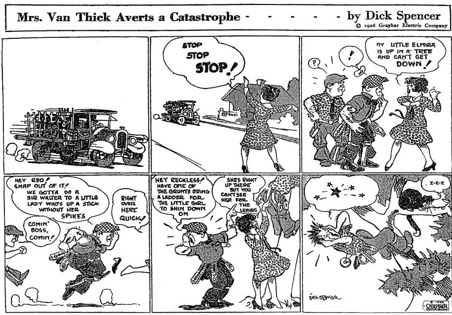

Here's a head-scratcher of an ad strip. These were run by Graybar Electric, a manufacturer of electrical components (like fuseboxes, outlets, etc) in 1926. If you read these you'll find that they really make no particular reference to the company's products. I guess this was the ol' soft-sell?
Anyway, reason I show these is because they're credited to one 'Dick Spencer', but I'd say they're actually by Jack Patton, who is most famous for his Texas History Movies strip. It was pretty much par for the course in those days to credit ad strips to fake generic names like that, and part of the fun of them is trying to figure out the identity of the cartoonist.
EDIT: Pablo Medrano Bigas writes to tell me that Dick Spencer really did exist, or at least is most likely not a pseudonym for Jack Patton. He sent me some other advertising art also signed by this Spencer chap. Thanks for setting me straight Pablo!
Friday, October 28, 2005
Obscurity of the Day : Modish Mitzi

What do you get when you combine a fashion column with a comic strip? You get one really boring comic strip, that's what. Modish Mitzi was the first of the genre that married the two forms. As you can see from the sample (which is believed to be the very first strip, appearing on 11/19/1923), there is a polite nod to the convention of telling a story, but the strip is actually just a vehicle for discussing dress fashions. The orchestrator was one Jay V. Jay, presumably feeling safe from critics hiding behind a nom de plume. It is a pseudonym, I presume...
Believe it or not, someone must have actually liked this idea, because, incredibly, Modish Mitzi ran for over 15 years. On top of that it even spawned imitators. A few other titles of this genre are The Stylefinder Family, noteworthy for expanding its horizons to fashions for the whole family, and The Connoisseur, singled out for discussing etiquette and high society in addition to the fashion basics. But easily the most bizarre of the lot is Comrade Kitty, which discussed proletariat fashions in the socialist newpaper The Daily Worker.
Labels: Obscurities
Comments:
Found out who "Jay. V. Jay" was.
An article in the August 13, 1926 Oakland Tribune (pg 21) identifies the creators as Laura Johnston (artist) and the writers as Virginia Vincent and Jeanette Kienkiveld. All associated with the fashion industry.
Post a Comment
An article in the August 13, 1926 Oakland Tribune (pg 21) identifies the creators as Laura Johnston (artist) and the writers as Virginia Vincent and Jeanette Kienkiveld. All associated with the fashion industry.
# posted by : 11/22/2007 9:21 AM
: 11/22/2007 9:21 AM Thursday, October 27, 2005
Obscurity of the Day : Make-A-Comic
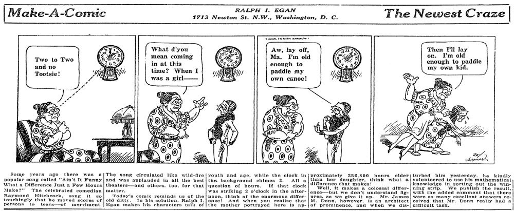
Here's a short-lived reader participation strip from 1925. Each strip first ran in the paper with empty balloons and readers were solicited to send in their captions, $5 to the winning entry. The strip would then run a second time with the winning captions added. As you can see from our sample, which is about par for the course, the competition was not particularly fierce. The strip's creator obviously recognized that the entries weren't too hot, so he added a text piece below each installment -- it displayed more humor than anything that appeared above.
The creator of this strip is Ray Hoppmann, a journeyman cartoonist who bounced around most of the lesser syndicates. Although he has many and varied credits, there's not one series in his resume that wouldn't easily qualify for our obscurity of the day.
Interesting tidbit - this is the only strip ever distributed by Readers Syndicate (at least that I've found). They had a few panel cartoons, but, as their name implies, they specialized more in text material.
Labels: Obscurities
More from Mencken
Came upon another interesting passage from H. L. Mencken's wonderful book Newspaper Days 1899-1906. Again, highly recommneded for any student of the newspaper game. Too bad Mencken hates cartoonists, though, as you'll see anon:
"Save on a few metropolitan papers, the Sunday editor of today is not much concerned about his pages of colored comics, for they are supplied by syndicates, and most of them are printed by outside contractors, far from the office. But in 1901 there were no syndicates [not true - ed.] and every paper had to prepare and print its own. This work, untrained as I was, gave me endless torment, for I quickly found that comic artists were a temperamental and nefarious class of men, that engraving departments were never on time, that pressmen had an unearthly talent for printing colors out of register, so that a blue spot intended to represent an eye usually appeared clear outside the cheek, and that plates plainly marked red were often printed as yellow, and vice versa. The first page of the color sheet, in those days, was seldom given over to comics [he means the color magazine section here, some papers had the the comics as part of the color magazine rather than as a separate section-ed], which were still regarded as somewhat infra dig.; its more usual adornment was a large picture of a damsel in an hour-glass corset and trailing skirts, labeled "The Summer Girl," "The Spirit of Thanksgiving," or something of the sort. The artists who drew these sugar-teats were even worse characters than the concocters of comics, and needed more policing. If one of them delivered a drawing on schedule he was sure to be non est when the time came to block out the color plates, and if he did the color plates promptly it always turned out that he had done them wrong. There were weeks when I spent at least two-thirds of my working hours wrestling with these criminals. They were, taking one with another, very affable fellows, and they used to try to mollify me by presenting me with large colored drawings of beautiful gals without any clothes on, but my professional relations with them were usually strained, and it never gave me any pain when I heard that one of them had broken a leg or got soaked for heavy alimony by his wife. Toward the end of 1902, happily for my sanity, syndicated comics began to appear, and I need not say that I subscribed to them with cheers.
"The very names of the first ones are now forgotten -- Simon Simple, Billy Bounce, the Teasers, the Spiegelburgers [these are all characters of the McClure Syndicate - ed.]. Finally came Fooxy Grandpa, and we were on our way. Even so, it was necessary to keep a comic artist or two on call, for now and then the business office sold a quarter-page ad on a comic page, and something had to be cooked up to go 'round it. I not only had to supervise the preparation of this home-made stuff, but also to supply the ideas for it. The only ideas that the comic artists of that age ever produced on their own were either too banal to be used, or too lascivious."
Obscurity of the Day - Meet The Misses
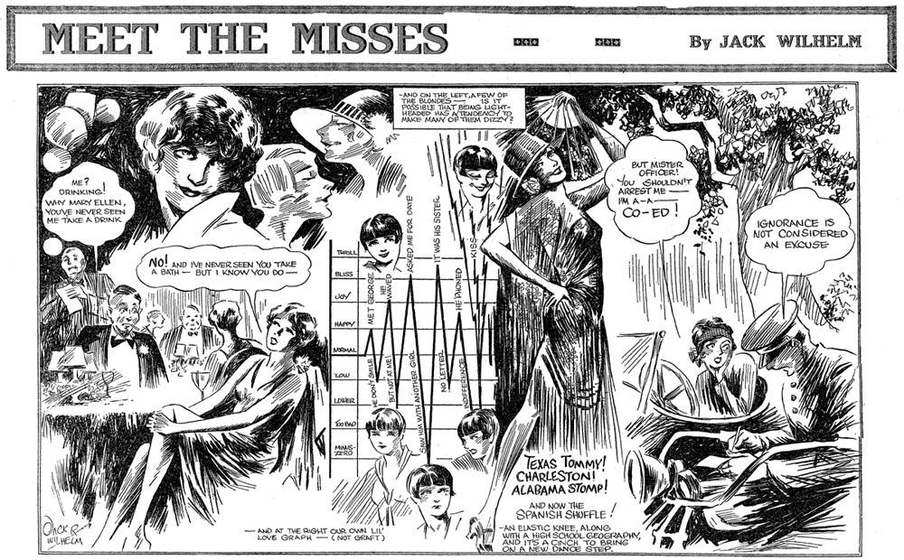
Here's a neat Sunday magazine section feature that has a lot of appeal. Meet The Misses ran from 1927-1929, a product of the struggling McClure Syndicate and the pen of Jack Wilhelm. Wilhelm went on to do the art on Frank Merriwell's Schooldays and a few other strips. No one will accuse Wilhelm of being an exceptional cartoonist, and his pretty girls aren't all one might expect of a feature devoted to them, but Wilhelm does have one thing going for him - he knows how to design a page for visual interest. This is the first page in the series.
Labels: Obscurities
Wednesday, October 26, 2005
Adventures of Willie Green
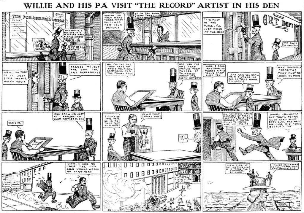
I just started indexing the Philadelphia Record of the 1900s, primarily for the start and end dates of their long-running feature The Adventures of Willie Green by Harris Brown. I've never seen the strip before, just knew it existed from the reprint books cited in the Overstreet Comic Book Price Guide. Well, now that I've seen a few of these strips I have to comment that I'm really blown away by the art, and show you an example. What a lovely style! Reminds me a bit of Herge's almost clinically clean linework.
Bonus on this example is that we get a look inside the Record's building (pretty darn elegant, eh?), and we have a visit with the paper's editorial cartoonist, John De Mar. Note that Harris still needs to learn about reversing camera angles, as panel 5 doesn't read properly. On the other hand, what a masterful little touch in panel 2 of having the clerk's word balloon peeking out from behind the partition.
Labels: Obscurities
Comments:
Are there copies available somewhere of Harris Brown's 52 page book of the best of The Adventures of Willie Brown?
# posted by : 9/23/2011 11:34 AM
: 9/23/2011 11:34 AM
Copies of "Adventures of Willie Green" are very rare. "Adventures of Willie Brown", on the other hand, probably doesn't exist ;-)
--Allan
--Allan
Not sure that it will help but I currently have a 1915 copy of The adventures of Willie Green at my comic shop. If you need anything I am more then welcome to help provide pictures or info as long as it is still in the shop.
Post a Comment
Tuesday, October 25, 2005
1895 Cartoonist Product Endorsement
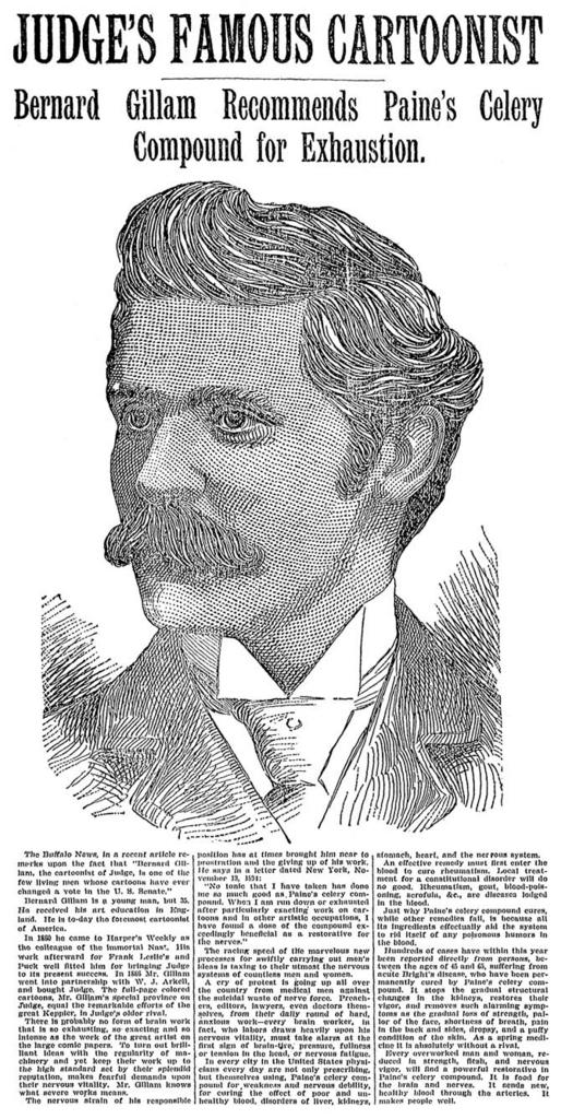
I could be way off here, but could this be the very first time a famous cartoonist appeared as a product endorser? And what a product to endorse -- one of the patent medicines of the day! I'm not familiar with Paine's Celery Tonic in particular, but you can bet that this tonic was mostly alcohol, as were most of them. Might even have been a cocaine product. You can read about this and other snake oil products here.
As you can read in the ad, Bernard Gillam was a part-owner and chief cartoonist for the weekly humor and political comment magazine Judge.
Monday, October 24, 2005
Early Ernie ("Nancy") Bushmiller Art

Here's a neat item I just found; an Ernie Bushmiller puzzle page from January 1925, just months before he would take over the Fritzi Ritz comic strip. As you can see, Ernie's art was somewhat more fussy in these early days of his career, he had not yet reached rubber-stamp nirvana. This puzzle page appeared in a Sunday magic and puzzle section supposedly edited by Houdini (yeah right...). The puzzles are really hard - I gave up on them pretty quick. Tell ya what - first person to post a correct solution to all the puzzles in this image will be sent a nice classic comic strip reprint book.
Sunday, October 23, 2005
Printing Plates - Can You Help?
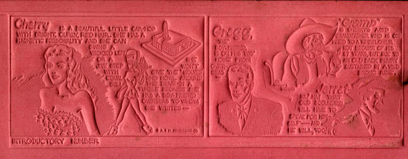
I'm requesting your assistance today. I recently purchased a large batch of printing forms for an ad comic strip called Cherry. While I can (barely) make out the strip on these intaglio cardboard plates (see above), it would be nice to get this collection into some more readable form.
Now my very shaky understanding of the printing process tells me that these little cardboard forms would probably be filled with a thin covering of molten lead. The image would transfer to the lead and then that hardened lead would be used as the printing plate. Have I got that right? If so, I may be stuck already since the idea of working with molten metal is a bit worrisome.
I tried scanning one of these and playing around with contrast etc. and I can get them a bit more readable, but still a long way from crisp linework.
So, can anyone provide suggestions for turning these little cardboard doohickeys into legible black-and-white strips?
Comments:
Very interesting - I thought all strips were hand drwan. guess not. very cool though. How many did you purchase of these?
The art was originally hand drawn. The syndicate/publisher/distributor uses it to make plates such as these that can be sent around to newspapers. The newspaper uses these forms to create metal printing plates. Of course, all this was before computers made all that guff unnecessary...
They're called matrix, Mats for short. They were sent to the paper along with a quality proof so the printer could tell what they were supposed to look like.
There were several ways of pouring them,all pretty much alike. My first job at a newspaper, after school, was sweeping up, running simple jobs on a small platen press, recycling the printers alloy in what was called a hellpot.
We dumped all the scrap into the pot which kept the alloy at a melting point. I skimmed the crud off the top, poured pigs for the linotypes, and clamped the mat into place, adjusted for size, and poured in the alloy by opening a tap. The result was called a stereotype. The mat could be used a number of times, so if a steretype went bad we could replace it. All kinds of graphics came this way, including clip art. There were also plastic forms that worked much the same way, but allowed for greater resolution. They were still in use about 35 years ago.
They were made by a press that forced the damp cardboard down onto a zinc engraving.
About the only way to get a good imaqge would be to pour something into them, then roll the top with an ink and press them onto paper.
Post a Comment
There were several ways of pouring them,all pretty much alike. My first job at a newspaper, after school, was sweeping up, running simple jobs on a small platen press, recycling the printers alloy in what was called a hellpot.
We dumped all the scrap into the pot which kept the alloy at a melting point. I skimmed the crud off the top, poured pigs for the linotypes, and clamped the mat into place, adjusted for size, and poured in the alloy by opening a tap. The result was called a stereotype. The mat could be used a number of times, so if a steretype went bad we could replace it. All kinds of graphics came this way, including clip art. There were also plastic forms that worked much the same way, but allowed for greater resolution. They were still in use about 35 years ago.
They were made by a press that forced the damp cardboard down onto a zinc engraving.
About the only way to get a good imaqge would be to pour something into them, then roll the top with an ink and press them onto paper.
# posted by : 11/16/2005 6:30 PM
: 11/16/2005 6:30 PM ![]()