Wednesday, February 22, 2023
Bringing Alley Oop to a New Generation, Part 3
Chris Aruffo is producing a new extensive series of Alley Oop reprint books, a labour of love project that has presented him with many challenges. I prevailed upon him to share some of his fascinating stories about the project with Stripper's Guide readers. This essay is the final of three.
If you are interested in reading the wonderful Alley Oop strips in high-quality but reasonably priced reprints, Aruffo's books are available directly from him, through your friendly neighbourhood bookstore or comic shop, Bud Plant, or Amazon.
I wasn’t expecting to do anything at all with reprinting Sunday strips. To begin with, I didn’t feel the same affinity for the Sunday strips as I did the daily. I just didn’t know them. Throughout my life, only the dailies were ever available to me as historical archives, whether in reprint or on microform. Even though I did read and save my paper’s Sunday section from 1985–1989, these were, obviously, much more slowly paced than the exciting daily stories, so I didn’t feel as involved with them. More practically, though, I couldn’t imagine where Sunday sources would come from. The strips I’d captured during the pandemic were digitized microfilm, meaning that they were low-quality greyscale distortions of color art and thus unreprintable. While I was arranging the first twelve daily reprint books, I didn’t yet know of any resources for daily proof sheets, let alone Sundays, so I didn’t even give it a moment’s thought.
Then Rick Norwood gave that first little push to the snowball: he asked me if I wanted to restore the two Sunday Alley Oop strips for his upcoming issue of Comics Revue. I had never restored a strip before, but it seemed like fun, so I said sure, why not. In return, I didn’t want any payment; what I wanted were high-quality color images of the Sunday strips, starting with the two for restoration and going all the way back to where the two Dark Horse volumes had left off (both of which I had acquired by then). I also requested that these be the original newspaper scans and not those images which had been adjusted and resized for the Revue. Rick obligingly sent me these from his archives—and, anticipating his future needs, he also sent me all the strips to finish off 1941. I set to work on the May 18, 1941 strip.
Initially my restoration process was a very light touch. I white-balanced the page to correct for yellowing, I darkened all the lines so that anything that was supposed to be black actually was, and I adjusted any off-register spots so that colors appeared within the lines they were meant to. Everything else I left as it was.
I finished the first two strips and sent them on to Rick. Then I thought… well, why don’t I just do the next two so he’ll have them ready before his next deadline? And I might as well do another couple… and after that, well, why not two more? And now, while I’m on a roll, I might as well just finish off the year. And with those done… well, won’t it be fun to go back and restore the earlier ones as well, for my own enjoyment? And gradually, ever so gradually, it dawned on me that, if I keep this up, I will have two and a half years of restored strips, which is plenty enough to create a complete book picking up where Dark Horse left off. But I had to find out: was I too late? Was Dark Horse already planning a Volume Three? Their two books had been published six years prior, which seemed indicative, but, to be certain, I wrote to the editor of those books, Dan Chabon, who confirmed that Dark Horse had no further interest. So it could happen. Even so, I didn’t tell anyone that I was considering a Sundays book. For one, I still didn’t have all the sources I needed, because in a number of cases Rick had only the half-size strip. Mainly, though, despite still being cloistered by the pandemic, I didn’t know whether I would have the patience and the stamina for it. Even if I dedicated every scrap of my free time to the project, I could see it would still take many months to finish restoring them all.
My “light touch” didn’t last long. By the time I went back to the ’39 era, I was no longer making minor changes here and there. I was overhauling each entire strip. The first major change was prompted by my frustration with the June 29, 1941 strip. Each of the color plates was badly shifted across the entire page:

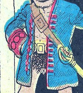
And so, because absolutely everything was off-register, I found myself carefully blotting and smearing along every line of every shape in every figure in every panel, and I became increasingly exasperated at having to adjust so many tiny little spots and stripes. Restoring this strip seemed to be taking forever, and the result certainly wasn’t enough of an improvement to justify the effort. The final straw was the front of Alley’s jacket, where I found myself having to repeatedly make the exact same fiddly little correction to each buckle and every button. I’d had it! Something had to change! But what could I do? I knew by now that there was no automatic tool or procedure that would work, because none of the colors or textures were at all consistent… except the black lines themselves. I suddenly realized that, yes, the black lines are consistent! Why don’t I just mask them off, erase everything else, and then put the color back in with the Fill tool?


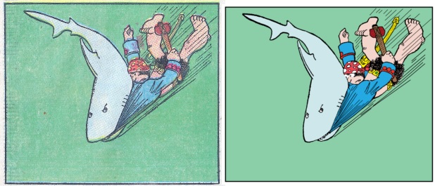
I tried this—and not only was it much easier and faster but I really liked the look of it:


Three strips later, I saw that this approach also had the bonus of homogenizing areas of color where the ink had faded unevenly:
In each instance I used the
newspaper scan to
match the original colors as closely as possible. From the June 29 strip
onward my process was
to blacken the blacks, white out the rest, and re-color the
strip.
A direct effect of this new approach, though, was that I was removing many halftone textures. I initially wasn’t sure whether this was a good idea. I had learned that some people insisted that halftoning was necessary for an “authentic” newspaper comic, and I worried that by making this change I might be inviting accusations of heresy. However, two factors helped make up my mind. Purple, brown, and gray had been a problem from the start; trying to blacken lines running through these colors automatically blackened all the abutting halftone dots, making the image ragged and bumpy. Hamlin’s shading lines looked like plucked grape stems! I had been grudgingly accepting this as an unavoidable problem until I encountered one panel, from October 5, 1941, which was entirely in purple:

No matter what settings I tried, every line came out jagged. The whole panel looked spattered and ugly. I finally realized that the only way to avoid this was to trace every line manually. But I couldn’t just grab a drawing pad and scribble at it; I am no V.T. Hamlin, and I feared the spectre of the Monkey Jesus. I used a mouse, and as I traced I kept my non-mousing fingers on the pixel-up/pixel-down shortcut keys so that every line’s width was exactly pixel-accurate to the scanned image. It took a much longer time, naturally, but when I saw the smooth new result I knew there was no going back. The halftone dots had to go. I was further encouraged in this decision when the University of Missouri sent me scans of their Sunday proof sheets—I was astounded to discover that Sunday proof sheets were all black and and white line art! The color choices had been made by the artists, but the halftoning textures required to produce those colors were not part of the artists’ work. Halftoning was an artifact of the newsprinting technology.
I can sympathize with folks who prefer to see halftones. Without halftoning, an old comic strip… doesn’t look like an old comic strip. And I appreciate how the halftoning can be seen as an integral part of the experience because it is a technological artifact of the medium. As an obvious parallel, there are those who will agree that listening to a vintage recording just doesn’t feel right, or seem authentic, unless it has the clicks, pops, and hiss of an old vinyl record. But I have to confess that I have no nostalgia for the newspaper medium itself. I want to see the art as clear as it can be—as close to Hamlin’s original as possible. I don’t want to see it run through a technological filter. For the same reason, I didn’t use any modern coloring techniques, either, with airbrushed highlights and shadows and gradients. That calls attention to itself; it too is an imposition on the original art. Hamlin’s original colorist used flat color (and the occasional gradient); and respect for the original artists’ work, in both line and hue, was my mantra. I don’t think I’m alone in this aesthetic. I recently read the delightful hardcover volumes of Peanuts Every Sunday, and have seen some reprinted Mickey Mouse Sundays, that eschewed halftoning in favor of “remastered” flat colors. So, even though I can understand that halftoning is, visually, what makes a comic a newspaper comic, I have become convinced that removing that noise, and making visible the thin and subtle detail of the linework, results in something much nearer to what the artists created.

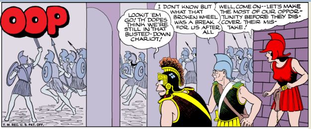
It took me nine months, all told, to restore the 139 strips of Volume Three. Along the way Gary Sanderson provided me with the full-page strips that Rick had missed. I typically started with the last panel and worked my way backwards; when I worked start to finish, it always seemed exhausting to reach the final panel of the main strip and then still have three or four panels of “Odds n’ Ends” yet to go. Whenever I saw purple, brown, or grey anywhere, I groaned, because I knew that I was in for a lot of tracing. There were indeed certain panels (usually purple) where every single line had to be traced:
and some panels had specialized coloring that wasn’t just filling in the blacks. When I got to August 18, 1940, and I saw a purple panel that also had extra-thin lines and special coloring, I decided to time myself to see just how long it would take:
Because the bricks were entirely purple, those little hatching lines, and the outlines of the figures against the bricks, and of course the bricks themselves, all had to be traced (2 hours). The garments’ folds had to be traced because they were too thin to fill (1½ hours). Then I blackened the rest of the lines (½ hour). Then I put the colors back in, including the gowns’ opacity effects and the motion lines (1½ hours). That added up to five and a half hours for one panel, out of thirteen panels, out of a hundred thirty-nine strips.
While I was working on this project I had no shortage of suggestions from experienced touchup artists on what tools or filters I could try that might expedite the process, but all of those suggestions relied on at least some level of color consistency (across a panel) or some level of color difference (between the “black” lines and the halftone dots) and these old strips had neither. Any automatic process that successfully cleaned up one small area would inevitably ruin another. So I just kept plodding away. When I got back around again to May 18, 1941, where I had started, I thought I would be done—but my standards had changed so drastically that I had to do it again from scratch, along with the rest of 1941. It was fortunate that, as I again worked my way into late 1941, I found (why I was looking, I don’t remember) that the Austin Standard-Examiner had originally published their Sunday strips without color, and that these images were available in high-resolution grayscale on newspapers.com. Not all of their images had been digitized with good quality, and soft grayscale still had to be carefully restored into sharp black and white; but, for those weeks where I could use these grayscale strips, the lines were cleaner and more distinct than the color scans had been:

And, eventually, finally, I reached the end.
Toward the end I asked two people to provide front matter. I’m usually indifferent to editorial matter. I get a reprint book because of my interest in the strip, and the front matter is typically written by someone who was never directly involved in making it. In this case, however, Jonathan Lemon, the strip’s current artist and a long-time fan, was willing to provide a foreword, and the introduction was written by Pete Malik, who at age fifteen had paid a personal visit to Hamlin and Graue. Graue felt close enough to Pete, after that meeting, to make Pete a character in the strip (“Casey”, who visited the Island of Dinnys with Alley Oop and Toko in 1973), and Pete has vivid memories of his conversations with the artists. This book seemed a perfect opportunity to share with Hamlin’s fans some of Pete’s personal experience of the man. So these two pieces became the first pages.
Then, of course, the book needed a cover. I got John Cochran’s approval to use the art-deco frame design that they’d used for Volume One and Two, and, using a scan of Volume One, made sure that the lettering and design elements were the same sizes and proportions on the front and spine. For the cover’s central image, I kept trying different panels from various strips, but nothing seemed as energetic or exciting as I felt it should be. Then I remembered an unusual image I’d seen on eBay. After some searching I found it—an old fanzine, Yesterday’s Comics, had featured on the cover of its third issue a promotional drawing of Alley Oop, bursting out of a comics page, gleefully astride a speeding locomotive. I ordered the issue, scanned the image, colored it to resemble the 1930s “Orange Blossom Special” and placed it into the frame, where it fit beautifully.

I sent the book to the printer (Art Works Fine Art Publishing in Los Angeles) and waited to see the proof copy… and what they showed me was captivating. Astounding. Even better than I’d imagined! I could hardly wait to see it bound and finished… and, three months later, after it made its way through shipping and customs, I did. The book is now officially released and received. I’ve been gratified to hear from people who are delighted to finally have these strips in their hands and who enjoy the quality of the restoration. It was for everyone’s enjoyment that I did this, and it’s so rewarding to see it so well received.
It seems short shrift to now tell you so briefly how I came to create the other Sundays book currently slated for release, Complete Sundays 1982–1984. But the short version is this: Joseph Owens sent me scans of his early-80s collection, and I began restoring them mainly because, after those ’40s strips, they seemed to take no time at all. I had finished 1982 before I visited the Billy Ireland Cartoon Library and discovered that they had Sunday proofs for those years; I was pleased to see that my restorations were as good (or even better!) than the proofs, so I hadn’t wasted my time, and I proceeded to color ’83 and ’84. I found that a three-row arrangement of the strips would make a Graue Sundays book the exact same dimensions as the Graue dailies book, so it seemed irresistible to create one. I contacted United Media to add one more book to our agreement, and they signed off on it, so I sent it to the printer. This final product also looks beautiful; it’s just waiting for its official release date.
So a big question: will there be more?
Until I visited the Billy Ireland Cartoon Library, my answer would have been a firm “no way.” I don’t have another nine pandemic-locked-in months to make a Volume Four. But now that I know the Museum has so many years of Sunday proofs—including 1942—the question is not whether there will be more Sundays books but how many there will be. On the production side, if I have mostly proof sheets and only have to restore some newspaper scans, that’s enough to make me keep working at it. I already have, and have colored, proof Sundays from 1955 and half of 1954:

On the release side, it depends one hundred percent on whether the books break even financially. I’m happy to say that it seems inevitable Volume Three will break even a few months from now, paving the way for Volume Four, which will be exactly the same format, size and price as Volume Three. The 1982–1984 book is a test case, because I don’t know what demand there is for Graue Sundays. If enough people order it, then I’ll proceed with 1985–1987 and 1988–1990, which are ready to go:
and then work back to other years. In short, because of the idiosyncracies of acquring and processing the source materials, the Sundays books may not come out in strict chronological order—but as long as people order them, I will continue to work to make the series live up to the name of Complete Sundays.
The Sundays books are available at http://www.aruffo.com/alleyoop; Sundays Volume Three can also be found on Amazon.
Anyway thank you so much for persevering ... and preservation!

 : 2/25/2023 7:46 PM
 ![]()